

This is about something that was not the big headline from the Charlotte City Council tonight.
 The big news, of course, was that the council passed a new budget that raises the city's property tax rate by a little more than 3 cents, from 43.7 cents per $100 assessed value to 46.86 cents, to pay for a huge bundle of building projects. Those projects include a cross-city bike/ped trail, renovating Bojangles Coliseum (the original 1950s Charlotte Coliseum on Independence Boulevard), building a new 911 call center, and so on. (Read more here. And here's a link to the city's budget department.)
But during the dinner meeting, the council heard a short presentation from a couple of planners about an idea to help the new light rail line look a little better than the first one, the Lynx Blue Line. "Some of the components of the Blue Line we wish that we could have done better," Planning Director Debra Campbell said. So for the Blue Line Extension, city planners and the Charlotte Area Transit System are looking to use some of the already budgeted art-in-transit funds to dress up a number of the walls, bridges and other light rail equipment whose design can range from boring to bleak.
Example of a standard wall finish (taken from tonight's slide presentation) is above, right.
Now, however, designs have been drawn for concrete for walls that is molded with a flowered pattern. Here's an example of a typical wall, and then the one CATS and the city hope to build, instead. (All images courtesy of the City of Charlotte.)


Here's a rendering of how some of the more artistically designed walls might look:
The light rail bridge that will be built over Harris Boulevard near UNC Charlotte could have an artistic railing, with a pitcher plant design on the piers:

And, for about the 200th time, council member Andy Dulin complained about the gray and orange color scheme on the bridges along the already built Lynx light rail line. Those colors were chosen by artists, he said, and he thinks they are unattractive. I don't always agree with Dulin but he is spot on in this assessment. The color that was supposed to conjure the red clay soil of the region instead conjures a Home Depot sign. The blue-gray of the Southern sky is more like battleship gray.
The planners assured Dulin that orange and gray would not be used.
 The big news, of course, was that the council passed a new budget that raises the city's property tax rate by a little more than 3 cents, from 43.7 cents per $100 assessed value to 46.86 cents, to pay for a huge bundle of building projects. Those projects include a cross-city bike/ped trail, renovating Bojangles Coliseum (the original 1950s Charlotte Coliseum on Independence Boulevard), building a new 911 call center, and so on. (Read more here. And here's a link to the city's budget department.)
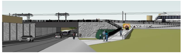
But during the dinner meeting, the council heard a short presentation from a couple of planners about an idea to help the new light rail line look a little better than the first one, the Lynx Blue Line. "Some of the components of the Blue Line we wish that we could have done better," Planning Director Debra Campbell said. So for the Blue Line Extension, city planners and the Charlotte Area Transit System are looking to use some of the already budgeted art-in-transit funds to dress up a number of the walls, bridges and other light rail equipment whose design can range from boring to bleak.
Example of a standard wall finish (taken from tonight's slide presentation) is above, right.
Now, however, designs have been drawn for concrete for walls that is molded with a flowered pattern. Here's an example of a typical wall, and then the one CATS and the city hope to build, instead. (All images courtesy of the City of Charlotte.)

And the nicer way to build a wall:

Here's a rendering of how some of the more artistically designed walls might look:

The light rail bridge that will be built over Harris Boulevard near UNC Charlotte could have an artistic railing, with a pitcher plant design on the piers:

And, for about the 200th time, council member Andy Dulin complained about the gray and orange color scheme on the bridges along the already built Lynx light rail line. Those colors were chosen by artists, he said, and he thinks they are unattractive. I don't always agree with Dulin but he is spot on in this assessment. The color that was supposed to conjure the red clay soil of the region instead conjures a Home Depot sign. The blue-gray of the Southern sky is more like battleship gray.
The planners assured Dulin that orange and gray would not be used.